Ferme Bagel Shop

Logo, Menu + Packaging Design
Short for fermented and also meaning ‘farm’ in french, Ferme brings you fermented sourdough bagels and farm fresh produce, fermented in house, by us, for you and your gut.
The natural fermentation process enriches foods with probiotics, which are beneficial bacteria that promote a healthy digestive system. We’re want you to eat foods that make you feel good... And taste even better,
Through this process, I utilized my skills in logo design, colour theory, layout design & typography. The result was a creation of a new brand identity, menu design, packaging design, and a cookbook cover. Programs used for this project include Illustrator, InDesign and Photoshop.
Logo Design


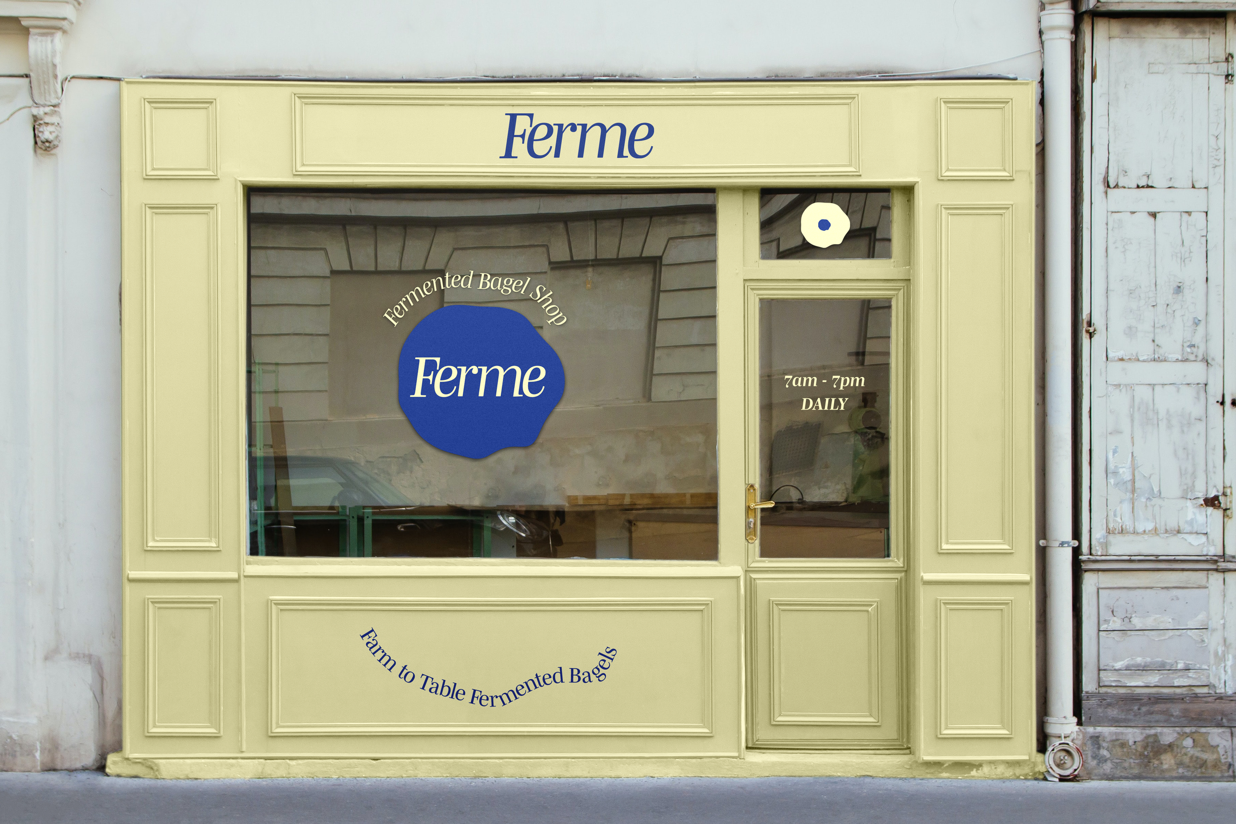
The logo design for Ferme Bagel Shop beautifully captures the essence of our brand. At its core is an abstract bagel, symbolizing the heart of what we do—crafting delicious, fermented sourdough bagels. The edges of the bagel are depicted with bubbly, organic shapes, representing the natural fermentation process that gives our bagels their unique texture and flavor. This design element reflects the lively, thriving nature of fermentation, subtly communicating the freshness and vitality of our products. The abstract approach keeps the logo modern and versatile, while the bubbly edges add a playful touch, making it memorable and distinctive.
Menu, Packaging + Cookbook Design


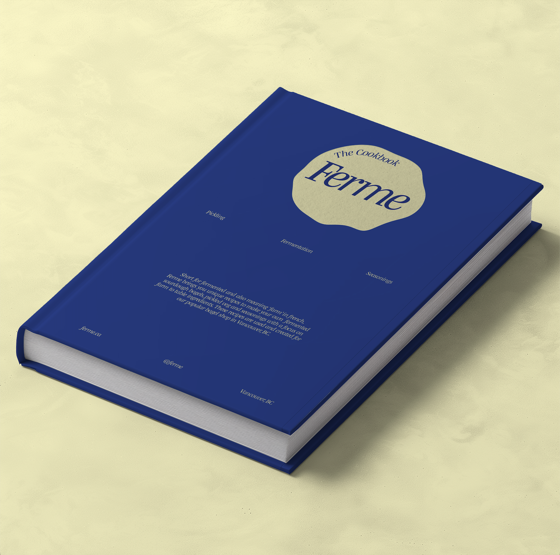
The design of Ferme Bagel Shop's menu, features sheet, bagel packaging, and cookbook reflects a cohesive and striking visual identity, unified by the brand’s signature cobalt blue and light yellow colors.
The menu is clean and modern, with a layout that balances readability with aesthetic appeal. The cobalt blue serves as the base, while light yellow accents highlight key items and sections, making it easy for customers to navigate through the offerings.
The features sheet stands out as a unique piece, incorporating the circular, organic shape of the Ferme logo. This shape flows through the design, creating a dynamic and engaging layout that draws attention to the shop’s special offerings. The interplay of the brand colors within this circular motif adds depth and visual interest.
The bagel packaging is simple yet effective, featuring the abstract bagel logo prominently. The bubbly, fermented edges of the logo are subtly echoed in the packaging design, creating a sense of movement and freshness. The cobalt blue background contrasts beautifully with the light yellow elements, making the packaging instantly recognizable and visually appealing.
Finally, the cookbook design is a blend of tradition and modernity, using the brand colors to create a warm and inviting feel. The cover features the abstract bagel logo, with the cobalt blue and light yellow used to highlight recipes and sections within the book. The layout is clean and spacious, with organic shapes reminiscent of the logo subtly integrated throughout the pages, reinforcing the brand’s identity while guiding readers through the culinary journey.
Projects
Roots Acupuncture
Kits Goods


Senior Dog Society
Science of Mindfulness
Ferme Bagel Shop